We optimized an image, leading to 4x in annual revenue. See? We didn't lie about how good we are.
- Home
- Case Studies
- Rogue N Raw
Amazon Product
Eyebrow Growth Serum
Version A
Version B
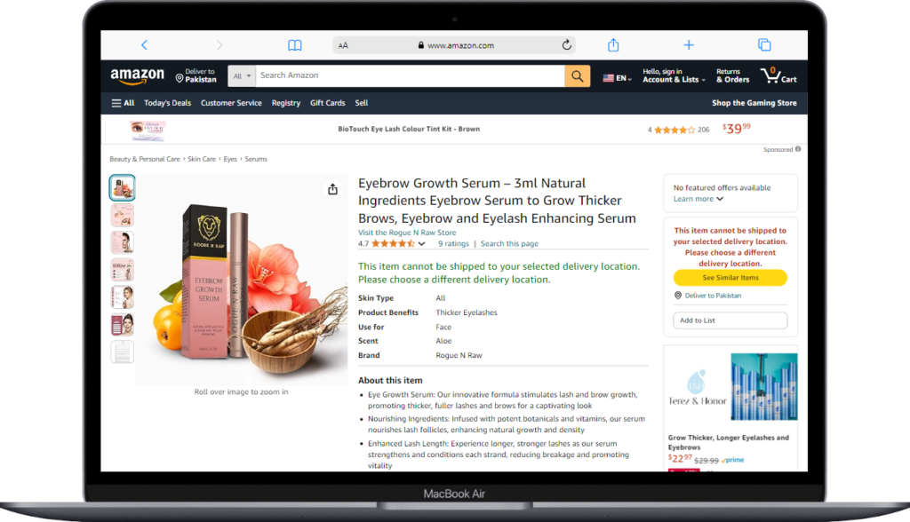
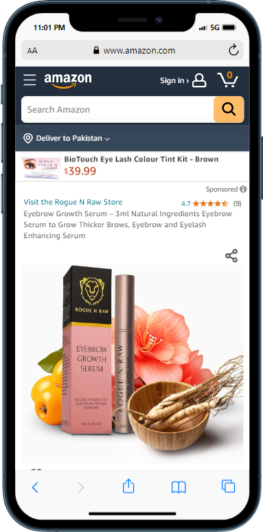
We aimed to analyze the impact of different main image designs on Amazon sales for the brand Rogue N Raw (a brand that sells facial cosmetics ).
Comparing the A/B testing of Image A and Image B of the main image, Image A featured a clear, detailed and catchy design, highlighting the Ginseng, flower and Loquat on the packaging.
On the other hand, Image B didn’t include those ingredients with the serum, potentially diverting attention from essential ingredients.
Objectives
The primary objective was to determine which version of the main image (Image A or Image B) resulted in higher sales and conversions on Amazon.
The test aimed to provide insights into the significance of visual elements and their influence on customer behavior.
Our Methodology

Data Collection
We randomly divided our target audience into two groups: Group A, which viewed Version A and Group B, which viewed Version B. We collected data on the number of sales and conversions generated by each group during a specified testing period.

Experimental Design
We ensured that the groups were similar in terms of demographics, interests, and other relevant factors. The only difference between the groups was the main image design they were exposed to.

Metrics
The primary metrics used to evaluate the performance of each version were sales and conversion rates. As these metrics provided direct insights into the effectiveness of the main image design in driving customer engagement and purchase intent.

Remarkable Results with Ecommstars
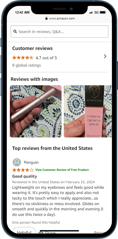
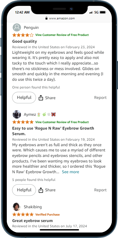
After analyzing the data collected from both groups, the results revealed that Image A performed significantly better than Image B with a 96% probability.
Sales: Group A (Image A) generated a significantly higher sales volume compared to Group B (Version B). This indicates that the clean and sleek design of Version A, which prominently displayed the Ginseng, flower and Loquat on the packaging, led to increased sales.
Conversions: Group A (Image A) exhibited a higher conversion rate by 5% compared to Group B (Image B). This led to 4X annual revenue for Rogue N Raw. This suggests that the clarity and focus of Version A‘s design enabled customers to make purchase decisions more effectively, resulting in a higher conversion rate, even though we thought the image was messy.
Explore Endless Possibilities
Thinking of long-term gains for your business-growth on Amazon. That's our vision.

+
